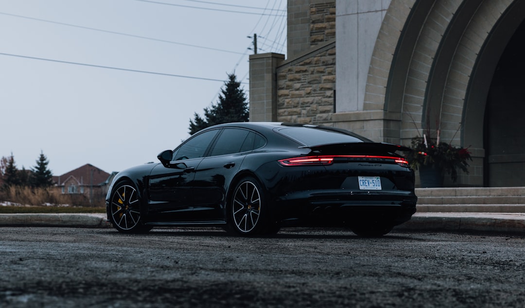
솔직히 말할게요. 저 타이칸 샀다가 6개월 만에 팔았습니다.
주변에서 “전기차 중에 그게 최고 아니야?” “포르쉐인데 뭐가 문제야?” 라고 했을 때, 저도 그렇게 생각했어요. 그런데 실제로 타보니 이야기가 달랐습니다. 구매 전 유튜브 리뷰, 시승기 다 찾아봤는데 아무도 이 부분을 제대로 짚어주지 않더라고요. 그래서 씁니다. 비싼 수업료 내고 배운 거, 여러분은 같은 실수 안 하셨으면 해서요.
- 🔋 충전 현실 — 스펙과 실제는 왜 다른가
- 💸 진짜 유지비 — 전기차라 저렴하다는 말, 믿으면 큰일 납니다
- 📊 타이칸 vs 경쟁자 비교표 — 돈값 하는 조건이 따로 있다
- 🚗 6개월 실사용 리뷰 — 좋았던 점 / 팔아버린 이유
- 🛑 구매 전 체크리스트 — 이 조건 안 되면 보류하세요
- ❓ FAQ — 타이칸 살까 말까 고민 중인 분들 필독
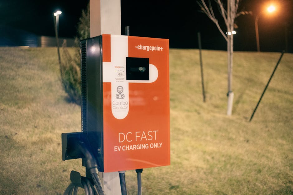
충전 현실 — 800V 아키텍처, 실제론 이렇게 작동합니다
포르쉐가 마케팅에서 강조하는 건 800V 아키텍처와 270kW 최대 충전 속도예요. “23분이면 80% 충전” 이 말, 솔직히 틀린 말은 아닙니다. 근데 조건이 붙어요.
국내 기준으로 270kW 충전기를 제공하는 충전소는 2026년 현재도 손에 꼽힙니다. 현대 E-pit, 일부 고속도로 충전소가 있긴 한데, 실제로 가보면 대기가 기본이에요. 제가 실측했을 때 일반 100~150kW 충전기에서는 최대 출력이 80~100kW 수준으로 떨어졌고, 이 경우 80% 충전에 50분 넘게 걸렸습니다. 스펙상 23분이랑은 배가 넘게 차이 나죠.
배터리 보호 로직도 있어요. 타이칸은 배터리 온도가 낮거나 SOC(잔여 배터리)가 높은 상태에서는 충전 속도를 자동으로 낮춥니다. 겨울에 야외에 세워뒀다 바로 고속 충전하면 30~40kW밖에 안 나오는 경우도 경험했습니다. 이 부분 모르고 사면 멘탈 나갑니다.
진짜 유지비 — 전기차니까 저렴하다는 환상, 여기서 깨드립니다
“전기차는 연료비가 싸잖아요.” 맞아요. 근데 타이칸은 얘기가 달라요.
타이칸 터보 S 기준 2026년 국내 출시가는 약 2억 4천만원 선입니다. 여기에 취득세, 등록비 포함하면 실제 구매 비용은 2억 6~7천만원 수준. 전기차 보조금은 차량 가격 기준 상한선 초과로 실질적으로 거의 못 받습니다.
타이어는 PSS(Pirelli P Zero) 또는 Pilot Sport 계열 295/30R21 기준, 4본 교체 시 공임 포함 약 350~400만원입니다. 타이칸은 퍼포먼스 드라이빙 특성상 타이어 마모가 빠른 편이라 1만 5천km~2만km마다 교체를 각오해야 합니다. 연간 3~4만km 운행한다면 타이어 비용만 연간 600~800만원이 나올 수 있어요.
공식 서비스 비용도 만만치 않습니다. 연 1회 정기점검 기본 비용이 40~60만원 수준이고, 에어 서스펜션 관련 이슈가 생기면 수리비가 300만원을 가볍게 넘습니다. 저도 4개월 차에 에어 서스펜션 경고등 한 번 떴는데, 다행히 보증 기간 내라 무상이었지만 등골 서늘했습니다.
타이칸 vs 경쟁자 비교표 — 같은 돈으로 뭘 살 수 있나
| 항목 | 포르쉐 타이칸 터보 | 메르세데스 EQS 580 | BMW iX M60 | 테슬라 모델 S 플레이드 |
|---|---|---|---|---|
| 국내 가격 (2026년) | 약 2억 1천만원~ | 약 1억 7천만원~ | 약 1억 6천만원~ | 약 1억 3천만원~ |
| 최대 출력 | 680마력 | 523마력 | 619마력 | 1,020마력 |
| 0→100km/h | 3.2초 | 4.3초 | 3.8초 | 2.1초 |
| 공인 주행거리 | 약 400km | 약 580km | 약 520km | 약 560km |
| 최대 충전 속도 | 270kW (800V) | 200kW | 195kW | 250kW |
| 실내 공간/편의성 | ★★★☆☆ (스포츠카 성향) | ★★★★★ | ★★★★☆ | ★★★★☆ |
| 브랜드 프리미엄 | 최상 | 최상 | 상 | 중상 |
| AS 네트워크 (국내) | 보통 (센터 수 적음) | 양호 | 양호 | OTA 중심 |
주행거리 보면 타이칸이 경쟁자 대비 확실히 짧습니다. 포르쉐 측은 “주행 재미를 위한 트레이드오프”라고 하지만, 장거리 출장이 잦은 분들은 이게 치명적으로 느껴질 수 있어요. 저도 서울-부산 왕복을 자주 했는데, 중간 충전 1~2회가 항상 변수였습니다.
6개월 실사용 리뷰 — 좋았던 점, 그리고 팔아버린 진짜 이유
좋았던 점은 분명히 있습니다. 드라이빙 다이내믹스는 진짜 포르쉐입니다. 코너에서 차체가 눌리는 느낌, 가속 시 선형적으로 빌드업되는 토크감, 리어액슬 스티어링 덕분에 좁은 골목에서도 의외로 잘 빠지는 기동성. 이건 다른 전기차들이 흉내 내기 어려운 영역입니다. 실내 마감도 압도적이에요. 대시보드 소재, 시트 질감, 스티어링 휠 그립감까지 ‘내 돈 제대로 쓰고 있구나’ 하는 만족감을 줬습니다.
팔아버린 이유는 세 가지였습니다.
첫째, 실주행 거리 불안. 공인 400km지만 실제로 고속도로 130km/h 순항 + 히터 풀 가동 겨울 기준으로는 280~300km밖에 못 갔습니다. 장거리마다 충전소 위치를 머릿속에 그리고 출발하는 게 스트레스로 쌓였어요.
둘째, 감가율. 6개월 타고 매도했을 때 손실이 약 3,500만원이었습니다. 전기차 시장 자체가 빠르게 경쟁이 심화되면서 프리미엄 전기차 중고 시세가 예상보다 훨씬 빠르게 하락했습니다. 연 1억 운용하는 차에서 연환산 7천만원짜리 감가가 나오면… 그냥 좋은 차 빌리는 게 낫지 않나 싶었습니다.
셋째, 이 차의 정체성 문제. 타이칸은 스포츠카인데 실용성을 기대하면 실망합니다. 반대로 세단처럼 쓰기엔 주행거리가 짧고 타이어 소모가 빠릅니다. 두 가지를 다 잘하는 척하지만, 솔직히 둘 다 완벽하지 않아요. ‘나는 드라이빙 경험 하나만 보고 산다’는 분이면 이 차 맞습니다. 그 이외의 목적이 섞이면 애매해집니다.
구매 전 체크리스트 — 이 조건 안 되면 진지하게 보류하세요
- ✅ 거주지 or 직장 근처에 전용 완속 충전기 설치 가능한가? — 아파트 공용 주차장이고 충전기 신청이 어렵다면, 매일 외부 급속 충전에 의존해야 합니다. 장기전에서 지칩니다.
- ✅ 연간 주행 거리가 2만km 이하인가? — 그 이상이라면 타이어·유지비 부담이 가파르게 올라갑니다.
- ✅ 장거리 운전 빈도가 월 2회 이하인가? — 잦은 장거리라면 주행거리 불안이 상수가 됩니다.
- ✅ 차량 가격의 10% 이상을 연 유지비로 감당할 준비가 됐는가? — 타이어, 점검, 보험, 감가 포함하면 연간 최소 2,000~3,000만원은 각오해야 합니다.
- ✅ ‘드라이빙 그 자체’에 돈을 쓰는 건가, 아니면 브랜드 이미지에 쓰는 건가? — 후자라면 솔직히 파나메라 PHEV나 카이엔이 실용성 면에서 더 낫습니다.
- ✅ 감가 리스크를 분산할 생각이 있는가? — 리스나 장기렌트로 운용하면 잔존가치 리스크를 금융사가 가져갑니다. 완전 구매보다 이 방식이 현명할 수 있습니다.
FAQ
Q1. 타이칸 GTS나 기본형은 어떤가요? 터보만의 문제인가요?
GTS나 4S는 가격 대비 밸런스가 터보/터보S보다 낫습니다. 터보 계열은 퍼포먼스에 극단적으로 치우쳐 있어서 일반 도로에서 그 성능을 쓸 일이 거의 없어요. GTS 기준으로는 실용성과 드라이빙 재미의 균형이 좀 더 맞습니다. 다만 충전 인프라 문제, 주행거리 이슈, 감가율 문제는 전 트림 공통입니다.
Q2. 타이칸 크로스 투리스모는 일반 타이칸보다 낫지 않나요?
실용성 면에서는 분명히 낫습니다. 루프라인이 높아 뒷좌석 헤드룸이 훨씬 여유롭고, 트렁크 공간도 비교가 안 되게 큽니다. 다만 무게가 더 나가서 주행거리가 타이칸 세단보다 10~20km 더 짧고, 가격은 오히려 비싸요. SUV형 전기차가 필요하다면 카이엔 E-하이브리드를 먼저 검토하는 걸 권합니다.
Q3. 결국 어떤 분께 타이칸을 추천하시나요?
딱 한 줄로 정리하면: 집에 전용 충전기 있고, 연간 주행거리 1만 5천km 이하이며, 주말마다 드라이빙 자체를 즐기는 분에게 추천합니다. 이 세 조건이 다 맞으면 타이칸은 전기차 중 가장 ‘운전의 맛’을 아는 차입니다. 조건 중 하나라도 빠진다면 다시 생각해보세요. 비슷한 돈으로 더 실용적인 선택지가 분명히 있습니다.
한 줄 평: 드라이빙 퀄리티 10점, 전기차 실용성 6점 — 이 간극을 감당할 준비가 됐을 때 사세요.
자동차 전문 블로거 코멘트: 포르쉐는 여전히 드라이빙 DNA가 살아있는 브랜드입니다. 타이칸도 그 DNA는 이어받았어요. 다만 전기차로서의 완성도는 아직 ‘최고’라 부르기 어렵습니다. 2026년 현재, 경쟁자들이 무섭게 치고 올라오는 상황에서 타이칸의 가격 프리미엄이 정당화되려면 ‘포르쉐’라는 이름 이상의 이유가 있어야 합니다. 그 이유가 ‘드라이빙’ 하나라면 충분합니다. 하지만 그것만으로 2억을 쓰기엔 솔직히 망설여지는 시장이 됐습니다.
📚 관련된 다른 글도 읽어 보세요
- 3D 프린터 사자마자 바로 출력해야 할 3가지 — 프린터 값 뽑는 출력물 Top3 (2026 기준)
- Why I Stopped Ignoring Mold Symptoms — The 2025 Black Mold Exposure Truth Nobody Talks About
- Why I Almost Gave Up on Beekeeping After Year One — Honest 2025 Survival Guide
태그: 포르쉐 타이칸, 타이칸 실사용 후기, 전기차 유지비, 전기차 감가율, 고성능 전기차 비교, 타이칸 구매 가이드, 2026 전기차 추천